My Blog
My Current Favorite Podcasts

I’ve been listening to podcasts for a few years now, rather casually. It’s only recently that I’ve started digging into them more and listening on a regular basis. There are a ton of podcasts out there, which means there are a ton of terrible podcasts out there. Fortunately, I’ve come across a few of what I consider to be the better ones.
These are my regulars, the one’s I nearly always listen to. Whether it’s when I’m doing dishing, cleaning up, going out for a run (a recent addition to me life), or just want something to listen to while I’m working, these are what I throw on.
The Important Ones
These podcasts are essential listening, as far as I’m concerned. They tackle important issues in interesting ways. And are generally really fun to listen to, too.
Of those, I’ve really been digging the first two. Both bring up a lot of good, divisive issues, and talk about them more frankly than other podcasts, which I appreciate. They’re both relatively new, but I’m hoping they stick around for a long time.
Song Exploder is pure joy for a musician (even a failed one). It’s absolutely fascinating listening to artists walk through their creative process. And the inside look at demos and single tracks from a mix are absurdly cool.
The Fillers
These are the podcasts that aren’t quite as important in my personal development, but they’re always a good listen. I use them to keep up on news, tech stuff, and get tips for personal productivity and general living.
- Mac Power Users
- The Free Agents
- Canvas
- Design Life
- The Gently Mad
- The Productivityist Podcast
- Shoptalk Show
My wife is trying to get me into My Brother, My Brother, and Me, but I haven’t gotten into it yet. I know some diehard MBMBAM listeners, though, so there’s got to be something to it.
Other than that, the rotation changes all the time. I’m always listening to new podcasts and seeing what’s out there. Which means I’m always looking for suggestions on what to listen to. Have a favorite podcast? Email me and let me know about it.
Reframing Growth
For the longest time, I’ve been against one of the most pervasive attitudes in the tech and business world: growth-at-all-costs. I’m still against that mentality, but my opinions have been evolving lately.
At an intellectual level, I understand that growth is what fuels businesses and the economy. Without growth, everything stagnates and eventually dies. But emotionally, it just doesn’t feel right. Pursuing growth over everything else in a business seems like a recipe for disaster. It leads to the hustle, which leads to the grind, which leads to burnout—both for individuals and businesses.
I can’t get on board with that.
I get why so many companies default to the growth-at-all-costs model, too. So many of them take outside investments that it probably feels like the only path to success for them. When you’re beholden to investors that want a lucrative exit in the next 2-4 years, massive growth is one of very few options left. And investment is so ingrained into our culture that most people default to it as the only way to build a business.
Still, I wholeheartedly think that the One True Path™️ for businesses should be the one laid out by DHH—making a dent in the universe, rather than trying to upheave anything and everything. Create a solid, sustainable business. One which cares about what the customers and employees want, not investors. One that doesn’t consume every waking hour and employee lives in the process. People should default to building a bootstrapped, balanced, longterm business.
It seems like growth is at odds with the “making a dent in the universe” model. Until recently, I definitely felt that, too.
Now, I think that growth is completely in harmony with slower, sustainable business. Growth-at-all-costs is not, but when a business grows more gradually and intentionally, it’s a great thing. That business will be more sustainable and, perhaps more importantly, will positively affect the lives of more people.
That’s the crux for me: helping more people. Until this past year or two, I’d have been against introducing sales and growth hackers and whatever the hell else you want to call it to most businesses, preferring organic, inbound customers instead. But now I think that having those people on a team is the way to go, assuming they understand the goals and values of the business. They help get products and solutions in front of more people, in theory helping those people solve problems and create better work and lives.
I think of Litmus, which only recently started building a sales team. For a long time, us tenured folks were anti-sales. But we’ve seen how effective sales and growth can be for getting our product (which we firmly believe improves the lives of email professionals) in the hands of people and companies that need it. There’s still the fear of growth adversely affecting our core company values, our culture, and our product, but by instilling those values and culture in the sales and growth teams, we can mitigate a lot of the problems that other companies run into.
The email industry is massive and only growing. But there are still so many shitty senders out there—the companies that send ill-conceived, broken, blast-y, spam-y emails on a daily basis. They need a tool like Litmus to help make email better for everyone. The only way we can help them do that is by growing and getting in front of them.
So, yeah… growth can be a good thing. It’s taken me a long time to reframe that in my own mind (and it’s still a work in progress). But I think for anyone that’s anti-growth, looking a little deeper at the benefits of growth and how we can temper the growth-at-all-costs mindset is a useful exercise.
What WCAG 2.1 Means for Email Marketers

Back in 2012, the International Standards Organization (ISO) adopted WCAG 2.0 as the digital gold standard for accessibility. WCAG 2.0 provided a set of guidelines for ensuring that digital content was accessible to as wide a range of users as possible.
While meeting WCAG 2.0 is still an excellent goal to strive for, a lot has changed in digital technology since 2012. As of June 5, 2018, a new version of WCAG has been launched as the recommended guidelines for building products and content for digital platforms. WCAG 2.1 builds on version 2.0 by adding 17 new criteria, bringing the total criteria (all the considerations you should be thinking about when developing digital products) up to 78.
Although WCAG 2.1 is mostly related to mobile and web applications and sites, HTML email marketers and developers need to understand the guidelines that WCAG provides. Email is digital content and, like everything else we all release, we should take every precaution to ensure that it’s usable by as many people as possible—regardless of their ability.
Here’s what email marketers and developers should know about WCAG 2.1, with a few thoughts on how to take the new criteria into account in your own email campaigns.
What’s New in WCAG 2.1
The 17 new criteria are largely categorized around three themes:
- Cognitive disabilities
- Low vision users
- Mobile users
These three task forces tackle different accessibility issues, and the new criteria address those issues in a modern way. Here’s a quick listing of what’s been added in the 2.1 recommendation.
- Orientation guidelines: So that digital applications support both landscape and portrait orientations.
- Identity input purpose: To help those with cognitive disabilities better understand input fields.
- Reflow guidelines: To prevent horizontal scrolling, which increases effort for low vision users on average 40-100 times.
- Non-text contrast guidelines: To increase the contrast of important images and UI controls.
- Text spacing guidelines: to make paragraph, letter, and word spacing, and line height, user adjustable for low vision users.
- Content on hover or focus guidelines: To reveal content hidden behind hover or focus states for low vision users.
- Pointer gestures: To aid disabled users who might not be able to complete complex hand gestures.
- Pointer cancellation guidelines: to prevent accidental activation of a function from a single pointer event.
- Character key shortcuts: To prevent speech-to-text users from inadvertently triggering functionality based on a shortcut.
- Label in name guidelines: To help speech-to-text users interact with content based on visual labels.
- Motion actuation guidelines: To prevent disabled users from having to perform difficult or impossible actions based on device motion.
- Status message guidelines: To make it easier to detect and understand status and alert messages.
- Identify purpose guidelines: To help prevent confusion around elements.
- Timeouts: To prevent data loss due to user inactivity.
- Animations from interactions guidelines: To prevent problematic side effects for users with vestibular disorders.
- Target size guidelines: To help make interactive elements usable for all users.
- Concurrent input mechanisms guidelines: To allow users to use multiple input mechanisms for easier use.
There is a lot that goes into each of those new criteria, and differing levels of acceptance for implementing them, both of which you can learn more about in the official WCAG 2.1 specification.
What You Should Consider in Your Campaigns
I know, I know… that sounds like a lot to take in. Not everything applies to HTML email campaigns (hell, most of it doesn’t), but there are still a few key takeaways for email marketers. Here’s what you should keep in mind when building your next campaign.
Make Emails Responsive
There are a few criteria related to making content accessible across different screen sizes. In particular, the criteria on orientation and reflow are directly applicable to email campaigns. Emails should be usable regardless of device orientation and when viewed on a screen of 320px, horizontal scrolling should not be required. This isn’t just important for disabled users, it’s important for all users.
If you’re not already, start using responsive coding techniques to allow your emails to flow and resize across screen sizes. These techniques typically combine any of the following to achieve responsiveness:
- Fluid instead of fixed tables
- CSS media queries for changing styles based on screen size
- Fluid images across screen sizes
- Text resizing based on screen size
- Content choreography to simplify layouts on smaller screens
Even though Gmail updated their rendering engine to support more traditional responsive techniques, the most robust method is still the “hybrid” or “spongy” approach, which you can read more about here.
You’ll also want to watch out for using fixed heights for elements that contain text. With the new text spacing guidelines, you need to make sure that text content isn’t cut off and hidden when resized. It’s almost always a bad idea to use fixed heights on anything but images anyways (and I’d argue about doing it then, too), so just fix that stuff now so you never have to worry about it in the future.
Consider Contrast and Size
Although text contrast has been a long-standing accessibility guideline, the new criteria specifies contrast rules for non-text elements like user interface components and graphics. Keep an eye on the contrast of button text and, if you’re using images or graphics like charts and info graphics, make sure the colors used have a high enough contrast ratio (3:1) for people with low vision.
Additionally, make sure your interaction targets are appropriately sized. Most people are using the 44px-by-44px rule already but, if you aren’t, now’s the time to fix that. There are a number of caveats to the new criteria, but keeping click and touch targets big with a decent amount of white space around them is a good guideline to follow.
Watch Those Animations
More and more emails are using interactive elements which include animations triggered by users, whether it’s in the form of hamburger menus, carousels, or in-email games and purchase experiences. It’s worth keeping an eye on those animations to prevent users with vestibular orders from experiencing problems. Keeping animations minimal and subtle is a good rule of thumb.
As many as 35% of adults over 40 years old have dealt with vestibular problems. If you’ve ever experienced vestibular issues, then you understand the chaos they can cause. If you haven’t, use a little empathy.
A Few Resources on Accessibility
As the Web Content Accessibility Guidelines grow, they can be difficult to keep track of or fully understand. Here are a few links to resources both for WCAG 2.1 and keeping tabs on the changing accessibility landscape.
What Email Marketers Can Learn From the Original Apple iPod

It was about being very focused and not trying to do too much with the device—which would have been its complication and, therefore, its demise… the key was getting rid of stuff.
That quote is from Jony Ive, the lead designer of many of Apple’s iconic products, in this case the iPod. While Apple does a lot of stupid things (getting rid of MagSafe and headphone ports, fucking up laptop keyboards, etc.), there’s one thing they almost always get right: Simplicity. Although Jony Ive was talking about product design, email marketers could learn a lot from his work and Apple’s overarching focus on simplicity.
Far too often, email marketers (or the stakeholders making the demands) try to cram as much as they possibly can into an email campaign. Product updates, company news, surveys, and events jockeying for position in the same email. Little thought is given to the content other than trying to fit it all in. Subscribers are overwhelmed. Email campaigns are ineffective.
It isn’t just email content, either. The underlying email strategy suffers, too. Especially with retailers, the cry is for, “More, more, more!” More emails, at all hours of the day, for “limited time only” sales that happen every damned day of the week, month after month. The desire to send more emails in the hopes of driving engagement works directly against that goal.
Jony Ive knew that more is rarely better. While competitors were busy cramming more features and specs into their MP3 players, Apple focused on getting rid of the things an MP3 player didn’t need. They focused on stripping the product down to its core, and the results were revolutionary.
In the same vein, email marketers should consider overhauling their own strategies and email campaigns. Audit your emails, document everything you send, then take an honest, painful look at those emails and see what you can kill. Strip onboarding drips down to their essentials. See which emails people actually open and dump the rest. Find out what content subscribers are actually interested in (hint: it’s not everything) and leave the rest on your blog.
Be thoughtful. Be focused. Be ruthless.
We might not be able to replicate the success of the iPod, but chances are that we can blow our competitors out of the water, just by stripping emails and the strategy behind them down to the basics.
Once You See It...

Inclusion is a lens through which you see the world.
Inclusion, accessibility, universal design, diversity… they are all powerful words and powerful tools for better understanding and improving the world. While they all—rightfully—have practical applications, there is a bit of magic to these terms as well:
Once you start learning about inclusion, accessibility, universal design, and diversity, they will quite literally change your outlook on the world. And—for all but the coldest of hearts—that change will be for the better. It’s nearly impossible not to notice their implications damned near everywhere.
Once you’ve read about Ronald Mace and Selwyn Goldsmith pioneering universal design in architecture and environmental design, it’s hard to overlook buildings or cities that don’t take disabled communities into account. As soon as you’re exposed to the online #a11y movement or read something like Laura Kalbag’s Accessibility for Everyone, you look at your own design, code, and copywriting in a new light. Once you’ve devoured everything Ashe Dryden has published, it’s extraordinarily difficult not to have diversity on your mind pretty much all the time.
And those are all amazing things.
These are topics that are worth discussing ad nauseam because, even if you’ve been exposed to them, more people haven’t. You might be sick of reading yet another article about alternative text on the web but, if that’s the case, your eyes are probably open to the importance of accessible images online. You may skip over an article on hiring people from underrepresented groups, but hopefully it’s because that is a part of your hiring culture anyways.
So many people haven’t been properly exposed to these ideas or haven’t discussed them enough. We haven’t changed their outlook and marginalized groups are suffering for it.
People are still talking about web standards in 2018, even after we moved on from table-based, all-image, or Flash-based designs. That’s because there are still people and organizations out there pushing shitty work to production. They build inaccessible, hard-to-navigate, mobile-unfriendly websites that but the burden of use on the user instead of themselves. As much as we’d all love to move onto topics outside of web standards, we can’t—they are absolutely foundational and always will be.
Similarly, a lot of us dream of a more enlightened, inclusive world but we won’t get there unless we keep discussing these topics in the open: publishing articles, writing books, posting videos, and—more importantly—having difficult conversations at home, in our communities, and in our workplaces.
There’s magic in inclusion, diversity, universal design, and accessibility, but only if we keep at it. We can flip those switches in people’s minds and open their eyes to a better world, but there will always be more people to educate.
Magic tricks are wonderful things. Once you see the technique behind one, you can’t unsee it. A magician’s trick is impressive on its own but—to me at least—it’s far more magical once you see the years of work and dedication that went into perfecting it.
Don’t shy away from that work, don’t stop discussing those important topics. Once you see the power behind them, you won’t be the same.
Inspecting Email Accessibility in Firefox
Over the past two years or so, I’ve been getting more interested in HTML email accessibility. It’s something I regrettably dismissed at one time and have been working to remedy ever since, even writing about the topic last year over on CSS-Tricks. There’s still a ton of work to be done for HTML email accessibility, but I recently saw something that could make developing accessible emails easier.
Mozilla’s accessibility evangelist, Marco Zehe, just published a post on Firefox’s new Accessibility Inspector, which is currently available in Firefox Nightly. Although the Accessibility Inspector isn’t a replacement for more robust testing using tools like screen readers or everything but the kitchen sink, it does provide an amazing outline of your web page (or email, in this case). By inspecting an element or the whole email, you can dig into the document outline (which is what screen readers use to navigate and expose content) and reveal all of the properties associated with the different elements in your document.
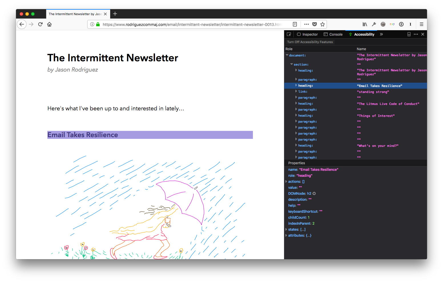
Depending on your email, this can be a very revealing exercise. I strive for simplicity in my own newsletters, which allows me to ditch HTML tables and create a cleaner, more semantic document. But I realize that’s not always an option for some brands. Many are still left designing with tables, which—when not accounted for—can result in some horribly inaccessible HTML emails. Sorry, DSW, but I’m using you as an example here.
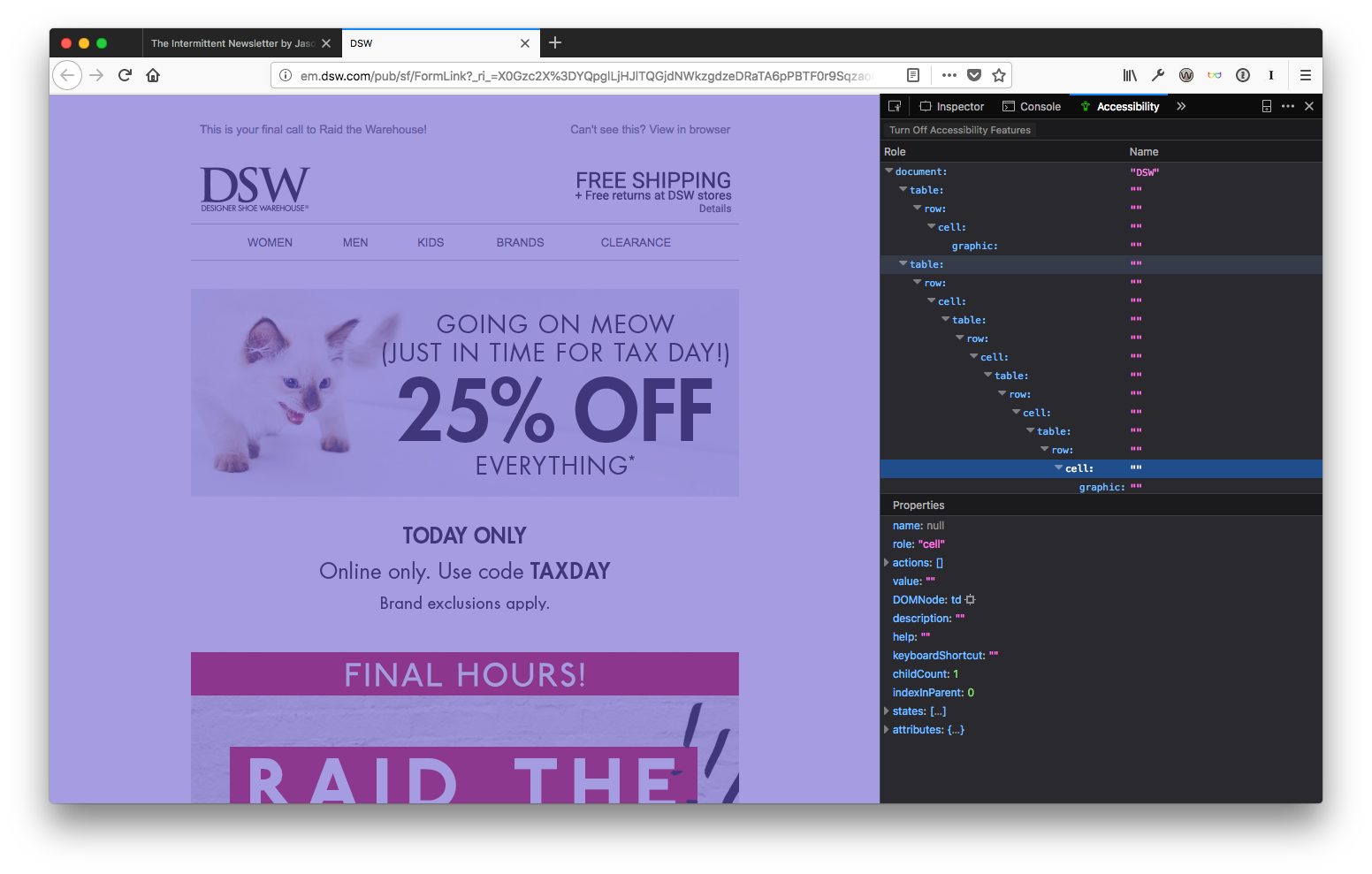
See all those tables, rows, and cells? That’s not good for anyone. The Firefox Accessibility Inspector is the best tool I’ve seen yet to quickly reveal the structure of a document in an accessibility context and could lead to some useful insights that would help make HTML email campaigns better for everyone.
Still, it’s a bit lacking (it’s early days, after all). That’s why I like combining it with two add-ons for Firefox that provide slightly more robust testing.
The first is the WAVE Accessibility Extension, which allows you to quickly test and highlight problems with your document. Clicking on the WAVE icon pops open a sidebar that runs the WAVE evaluation and gives you a summary of any errors, alerts, and features found in your document, with options to dig deeper when needed. My favorite WAVE feature, though, is the “No Styles” option, which strips CSS from your document. While missing CSS is a rare occurrence in email these days, it is useful for seeing your document structure and further highlighting your use of semantic, accessible elements. The “Contrast” checker is really useful, too, grading your color choices based on WCAG guidelines.
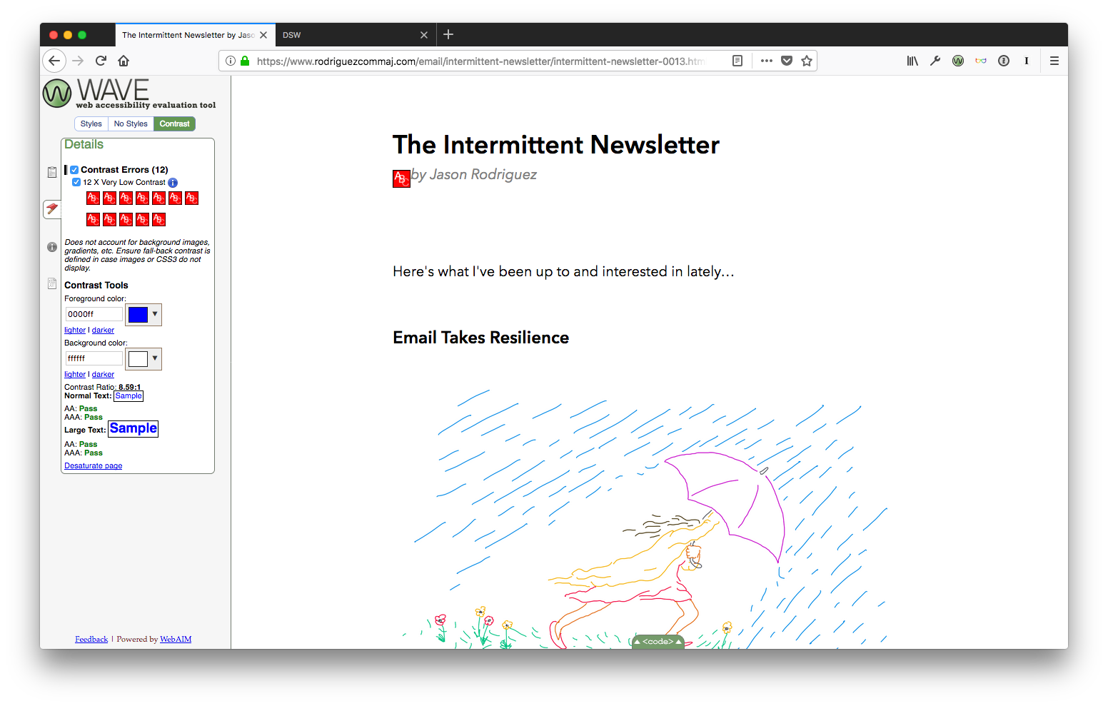
Looks like I have some work to do before my next send.
My other tool of choice is the Total11y: Accessibility Toolkit add-on. This one adds the Khan Academy’s amazing tota11y.js file to your page, which lets you easily inspect and check accessibility features. The killer tool here is the experimental “Screen Reader Wand”, which allows you to hover over text and see what most screen readers will read out loud to low-vision users.
It’s a much more elegant interface, but lacks the depth of the WAVE add-on. That’s why I like combining both, adding in Firefox’s new Accessibility Inspector to fully round out the environment.
Have any more tools that are vital to your HTML email accessibility testing workflow? Email me and let me know.
A Few Tips on Building Slides
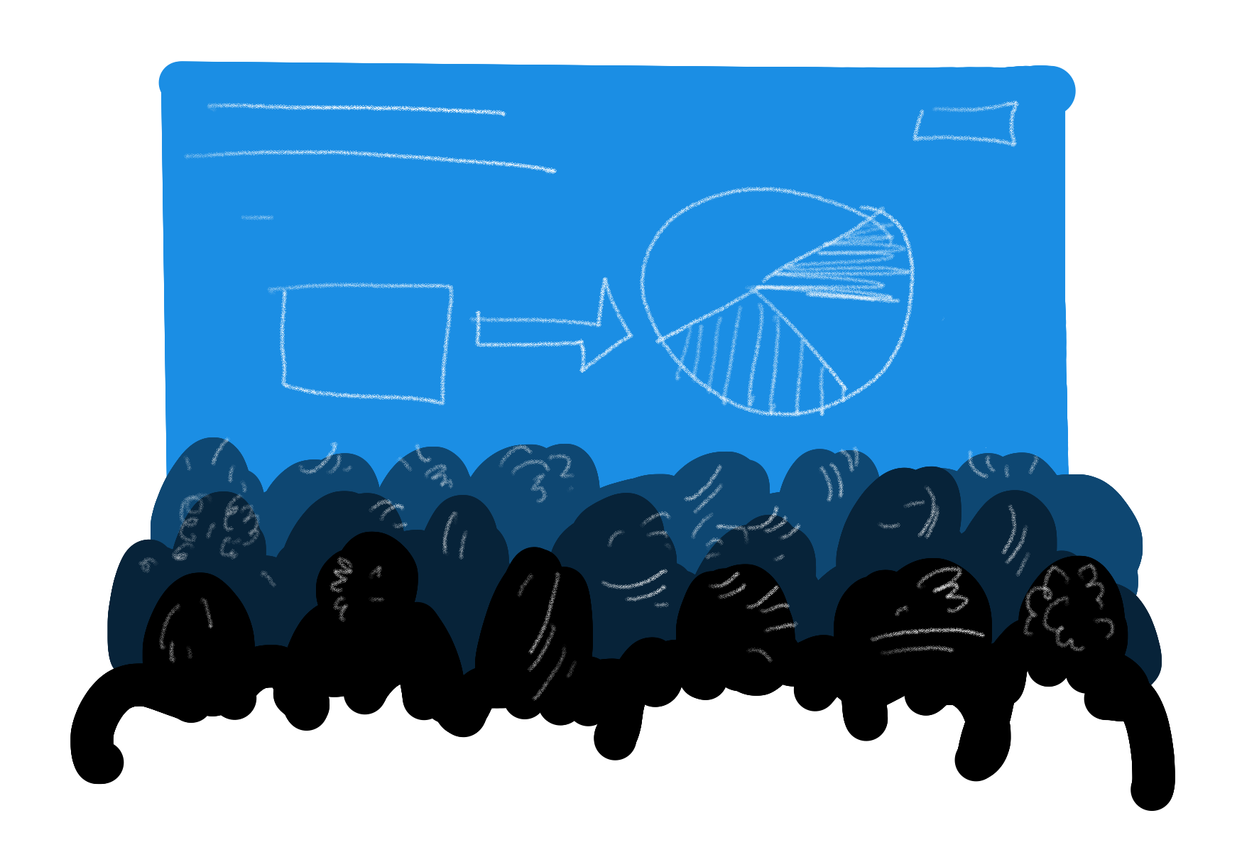
I’ll be conducting a fair number of presentations and workshops this year, and I’ll be in the audience for many more. And, although I’m not the world’s most seasoned or polished public speaker, I feel like I’ve learned a lot about speaking and teaching over the last few years that could help out others.
One of my favorite parts of speaking is building slide decks. Yep, I’m one of those sickos that actually enjoys spending time in Keynote, shuffling things around, styling content, editing the hell out of presentations. During all that time in Keynote (or PowerPoint, if a conference organizer is especially masochistic), I’ve learned a few principles that make for better decks and, in turn, better all around presentations. These principles have been reinforced by sitting through far too many shitty talks that didn’t take them into account.
Hopefully some of these tips will help when you’re preparing your own presentations. Disagree with any of them? Email me and let me know—I’m always looking to improve my own presenting skills.
Keep Things Simple
You should always strive for the simplest slides possible, in every aspect. Keep the content simple, keep the design simple.
Too often, speakers (me included) try to cram too much into their slides—whether it’s words, pictures, examples, hashtags, Twitter handles, logos, or branding and design elements. Don’t do that. You’re just distracting—or worse, confusing—your audience.
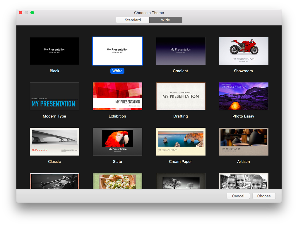
People rag on the default themes in Keynote, PowerPoint, or Google Slides. But I find some of them wildly useful. As a Keynote user, I nearly always start from one of two themes: the Black or White ones. They are brutally simple and make for a wonderful foundation for presentations. Still, I think they could be simpler.
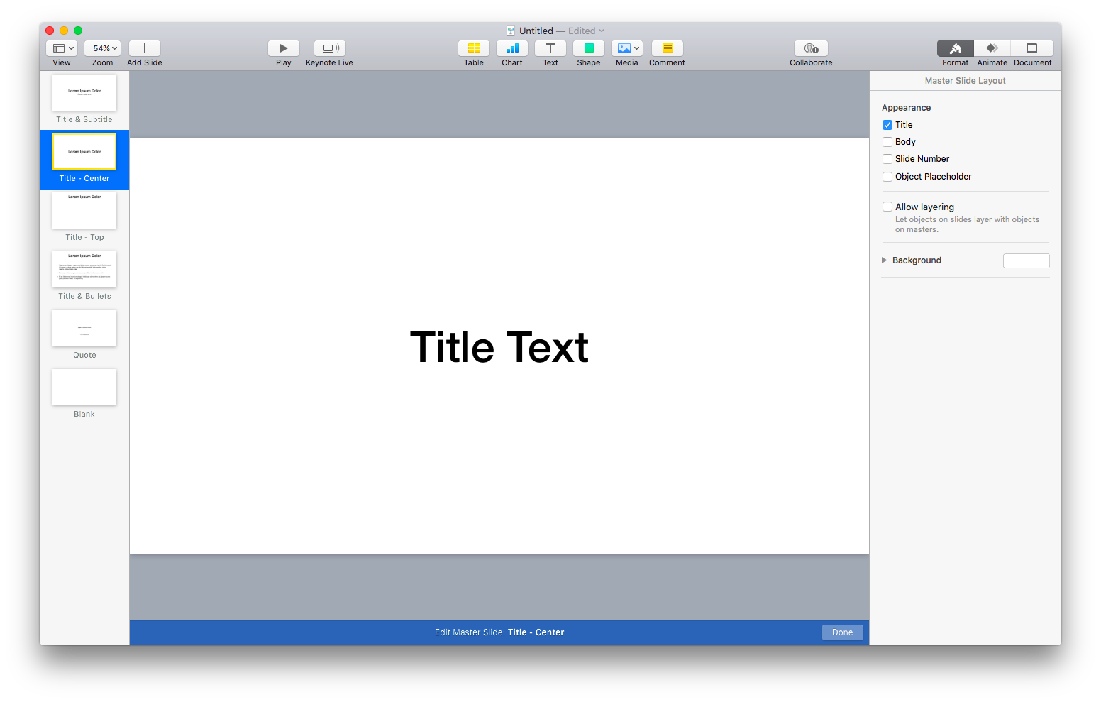
One of the first things I do is go into the master slides and delete a bunch of them. By default, both themes come with 12 slide variations. Although some of these can be useful, I’ve found most of them make for distracting slides. I prefer to whittle things down to about six variations:
- Title & Subtitle, which is used for the presentation title to kick things off.
- Title Center, which can be useful for sectioning the rest of the presentation, especially in workshops.
- Title Top, for headers on content slides.
- Title & Bullets, for when I do want text on my slides.
- Quote, for quotes, duh. I love using quotes to reinforce points or add a bit of humor to a presentation.
- Blank, which probably gets the most usage, to be honest.
I do think branding and style can be important for presentations, so I will customize the look and feel of those master slides. But don’t go overboard. Usually, this means updating the typeface (I love Avenir Next), adding background colors if needed, and updating the quote variation to look a lot better.
I’ve seen a lot of conference-provided themes that are almost universally complete garbage. They try to cram too much branding—logos, hashtags, dates, graphics, etc. If you run into these, push back and say you’ll use your own. If the organizer insists, use the colors from their themes, the title slide, and just build on completely blank slides for everything else. Don’t let terrible branding get in the way of good ideas.
The theme of simplicity should always carry over into the content of the slides, too. Don’t try to fit too much text, too many images, or too many branding elements on your slides. If you find your slides feeling cramped, break up one slide into a few. You can always go through them quickly, so don’t worry too much about having a ton of slides. If they’re simple and easy to follow, then you’re good.
Focus on Hierarchy
Although “less is more” is a good mantra for creating slides, sometimes you can’t get away from including a lot of content on a slide. That’s where hierarchy comes into play.
Hierarchy is organizing things to show levels of importance, usually using color, size, or position. Think of headings and paragraphs in an article like this. I use different size headings for the title, sections, and body of the article to make it easy to scan the article and understand what it’s about. The same principle should apply to your slides.
Use text size, color, and placement intelligently to make sure your audience can easily scan and follow along. A few simple guidelines:
- The bigger something is, the more important. The eye is drawn to bigger elements on a page or screen, so if you want someone to notice it, make it bigger. This applies to slides, but not all areas of life 😉
- More contrast equals more importance. Darker text on a light background or lighter text on a dark background draws the eye. If your copy is grey and your heading is black, people will notice the heading first.
- Position matters. English-speaking people (I’m in the US) read from top-to-bottom, left-to-right. Our eyes naturally go to the top left of a screen or page, so keep titles or important stuff there. Use the other space to reinforce that information. Use mostly left-justified text, too, for the same reasons and because it will help aid dyslexic audience members.
- Placement matters, too. Every element on a slide is related to every other element on that slide. Use this to denote importance. If you leave a lot of space around an element, that can make it stand out.

Use hierarchy to lead the audience around your deck. Focus their eyes—and, therefore, their attention—using these basic principles.
The Less Text, The Better
Although it may not seem like it from the length of this article, I firmly believe that the less text there is, the better—especially in presentations. People aren’t there to read a bunch of slides, they are there to listen to you. They want to hear a story, learn some new ideas, or be motivated. Forcing them to read a ton of tiny text on your slides actively works against all of that.
If you find yourself including a ton of text in your slides ask yourself, “Is a presentation the right format for this idea?” It’s OK if the answer is no. Sometimes ideas are better conveyed through articles, books, tweets, videos, or songs.
If you still have a lot of text and want to give a presentation, edit the hell out of your slides. Cut everything that’s non-essential, and then cut some more. Replace text with images, or explain your ideas verbally. Just get away from massive amounts of text. Your audience will thank you.
Keep Things Big
One of the side effects of using a lot of text is that the text ends up being small. And, depending on the size of the venue, when text is too small, it’s unreadable. The last thing you want during a presentation is everyone ignoring what you’re saying just to squint and struggle to read your slides. Keep your text as big as possible on your slides.
The same goes for any imagery, as well. Whether it’s a picture, illustration, icon, logo, graph, video, or GIF—try to keep them as large as possible so that people can easily parse what it is. I’ve found it helpful to split images onto their own blank slides, leaving any contextual text on the slides before or after the image so that people can quickly understand that content.
Keep Contrast in Mind
You will encounter a wild variety of venues. Some good, some bad, but all different—especially in regards to what projectors and screens they use and their lighting setups. All three can have a massive impact on how your slides display.
Horrible projectors with low resolution, old, yellowing screens, or too bright of lights in the room will result in slides that are hard to see. Especially for people sitting near the back of a room. You need to make sure all of your slides have enough contrast to be understandable no matter the environment.
Contrast is the difference between the lightest and darkest elements. For our purposes, that’s generally the text or images on the slide backgrounds. You want high contrast between the two so that they don’t blur together. Part of the reason why I suggest working from a simple theme like white on black or black on white. That’s about as high-contrast as you can get, so it’s hard to go wrong.
One situation where this can be difficult is when displaying code on screen. A lot of designers and developers use a dark theme: a dark background with colored text on top. It looks great on your laptop screen, but doesn’t translate well to the projection screen. I’d recommend either:
- Using a light theme, with a light background and dark text or…
- Drastically bumping up the size of the text in a dark theme
I understand the draw of dark themes for code. They’re gorgeous. I still use them a lot. But just make sure you buoy that lack of contrast with bigger text to keep code understandable for your audience.
Use Images Wisely
Speaking of images (or animations and videos): use them wisely. It can be tempting to put a bunch of timely, topical GIFs and memes into a presentation to illicit a laugh, but that can sometimes work against you. I definitely include funny GIFs on occasion, but I try to make sure they are in service to the point I’m making.
Always use imagery to reinforce your main message, not distract from it. And try to make sure the images are universally understood. People come from a diverse set of backgrounds, and not everyone understands what you understand. Even though you love the movie What We Do in the Shadows, not everyone will fully grasp the hilarity of Rhys Darby lecturing that they’re, “Werewolves, not Swear-Wolves.”
Also, strive for timeless slides. It can be very tempting to put in some topical images, but how do you think that will hold up down the road? If you’re sharing your deck with the audience or uploading it to something like Slideshare, it can stick around a lot longer than you think. Make sure that—when revisiting your deck a month, or even years, down the road—your audience isn’t left scratching their heads.
Finally, try to be diverse and inclusive in your use of imagery. If you’re using images of people in your presentation, use images that represent a mix of genders, races, ages, and cultures. Try to keep any prejudices (intentional or not) out of your presentations—you don’t want to exclude audience members through your use of images (or text, for that matter). Representation on stage absolutely matters, so take that into account. If you’re struggling to find diverse imagery, check out some of these resources:
- Nappy.co, which has a ton of free, beautiful photos of black and brown people.
- Representation Matters, which is all about ethnic and social diversity, and photography reinforcing a healthy body image.
- Blend, which has a massive library but isn’t free.
- The Women of Color in Tech Flickr Group, which has an awesome library that’s free to use.
Be Consistent
One of my biggest pet peeves is an inconsistent slide deck. By inconsistent, I mean one that doesn’t have consistent use of type, sizing, structure, color, and design. All of those elements can be used to reinforce your messaging and, especially in the case slide structure, aid audience comprehension.
For the most part, you want the overall structure of your slides to remain the same so that viewers can quickly understand content as you jump from slide to slide. That’s why I cut out a lot of those default slide variations—the fewer the variations, the less mental overhead for your audience. Your slides don’t have to be identical, but you should work within some constraints to simplify things for the audience.
Plus, if you keep things consistent between slides, when you do break out of that consistency, the audience will be surprised. You can use this effect to your advantage to better make points in your presentation, creating memorable moments for your most important ideas.
Ask Organizers About Technical Considerations
A quick, but important, tip. Always communicate with organizers so that you fully understand the technical requirements for your presentation. The better prepared you are, the fewer things that will go wrong (although something nearly always goes wrong).
A few things to check on:
- Slide size (Standard 4:3 vs. Wide 16:9)
- Is audio supported?
- Is video supported?
- Will animated GIFs work?
- Will you be using their machine or yours?
- If theirs, are you using non-standard fonts that need to be installed?
- Keynote, PowerPoint, Google Slides, etc.?
- Are emojis supported? (I ran into this issue just the other week)
And definitely make sure you can access your slides multiple ways: save them on your machine, back up to something like Dropbox, download them to a USB, and export them as a PDF on all of the above. Just cover your bases.
Edit, Then Edit Some More
Finally, the most important: edit the hell out of your presentation. Once you think you have your deck done, make multiple passes and cut out as much as you possibly can.
Your presentation should be about your ideas and your speaking. The deck is only there to reinforce both. Far too often, speakers use their deck as a crutch to prop up an ill-conceived talk. By editing your content, you force yourself to refine your ideas into a more cohesive, impactful talk.
Once you’ve edited things down, ask a coworker, friend, or family member to go through it. See if they can understand things or if there are any weak points. Perform in front of them and ask them not to hold back on feedback.
Then edit again.
Again, I’m nowhere near the world’s best speaker. But I’ve done this a lot and received enough feedback to know generally what works and what doesn’t. Hopefully these tips can help you out and, again, if you have any more, send them my way.
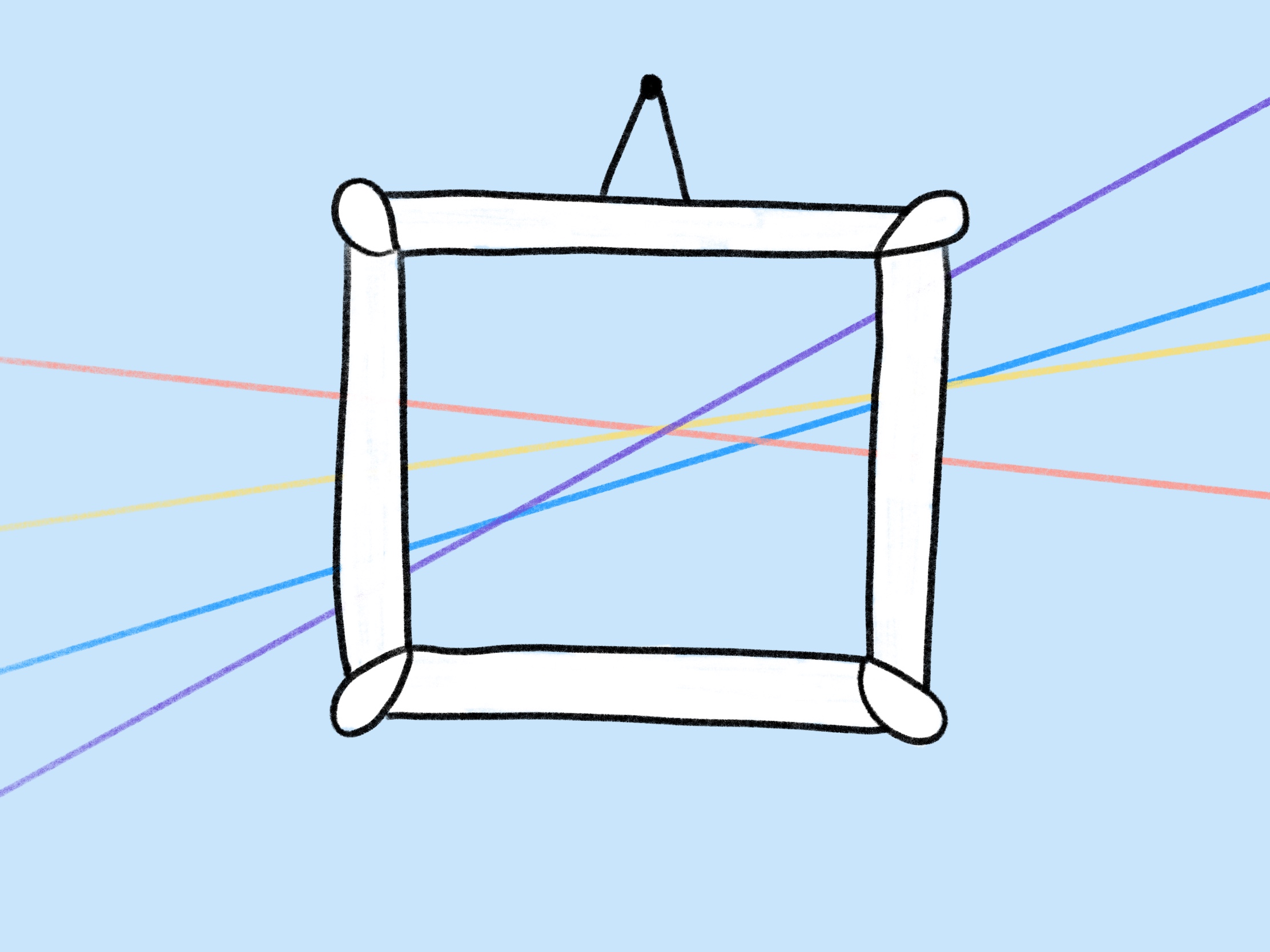
Email Takes Resilience
Dealing with email clients—their rendering engines conspiring to ruin your day, week, and year. New ones pop up all the time, while old ones stick around way past their welcome.
Email takes resilience.
In the face of other channels, striving to dethrone email, the still powerful queen. Ignore the pundits, who—annually—proclaim the death of email. To those who say that email is only for spam, we know that email can make a difference.
Email takes belief.
Uncaring stakeholders looking for a quick buck. They rent lists, they buy them, they blast everyone to hell. We hold their hands, educate, and show them a better way—even when we’re intimidated or shot down. We stick to it.
Email takes grit.
Underfunded, understaffed. Ignored, ridiculed, and left to languish in a lonely cubicle. The people in the weeds know what email can do. They give it their all, even when others care far too little.
Email takes heart.
Explaining to our parents that we’re not spammers. Explaining to our bosses that mistakes happen. Explaining to our developers that you can’t do it that way. Explaining to each other what worked and what didn’t.
Email takes patience.
Dealing with it all, not letting it get us down. Understanding the craft, the skill, and the art in email. Exploring what’s possible and showing others the way.
Email takes resilience.